Modernizing the MedicAlert Member Experience
Case Study
Redesigning how members manage critical health information across onboarding, health records, and emergency-access experiences.
Overview
MedicAlert provides members with secure access to critical health information that can be shared during emergencies through wearable IDs, QR-enabled experiences, and emergency responder access. As the platform evolved, the digital experience had become fragmented across onboarding, account management, and health record workflows, creating inconsistencies that made it difficult for members to manage and maintain their information.
As a Senior Product Designer, I worked across multiple initiatives focused on modernizing the member experience. My work spanned health record management, onboarding, dashboard redesign, emergency-access experiences, ecommerce modernization, and design system foundations. While each initiative addressed a different user need, they all shared a common goal: making life-critical health information easier to manage, maintain, and access when it matters most.
Product Design (UX/UI), Information Architecture, Workflow Design, Design Systems, User Testing, Mobile Experience Design, and Documentation & Governance
The Challenge
Managing health information is inherently complex. Members may need to maintain medical conditions, medications, allergies, physicians, insurance information, emergency contacts, medical devices, and advanced care planning documents. Over time, these experiences evolved independently, resulting in inconsistent workflows, duplicated interactions, and varying levels of complexity throughout the platform.
Focus Areas
Health Record Management
Create a more intuitive way for members to manage and maintain critical health information.
Consistency at Scale
Establish shared patterns that could support multiple health record categories without creating unique experiences for each.
Cross-Platform Experience
Ensure members could manage information confidently across desktop and mobile devices.
Emergency Access
Present critical health information clearly and efficiently during high-stress situations.
Organizing Complex Health Information
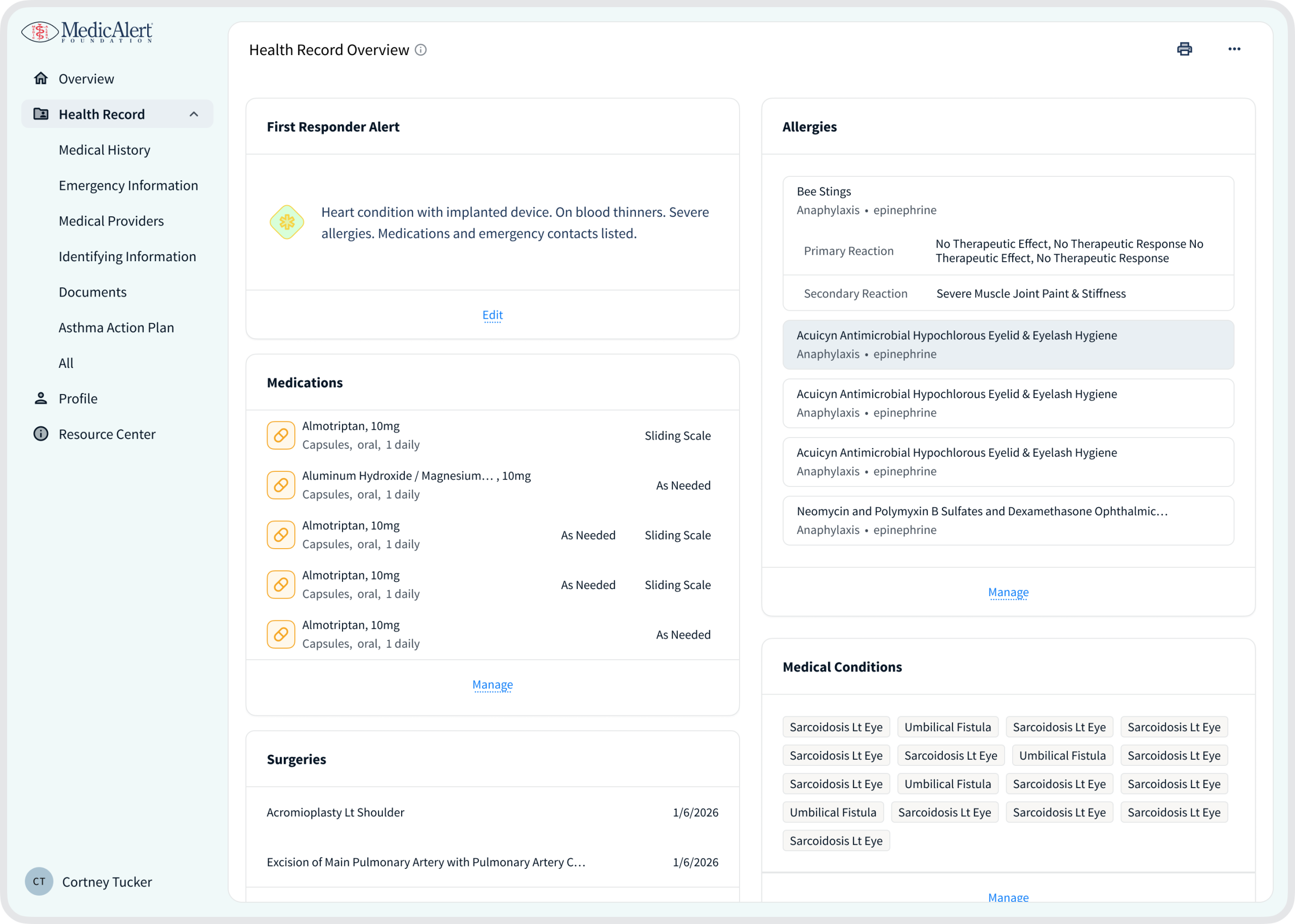
Before redesigning workflows and interfaces, it was important to establish a clear structure for how health information should be organized across the platform. Members interact with a wide variety of information types, each with unique requirements and relationships.
I helped define a more scalable information architecture that organized health information into clear domains while standardizing how information would be displayed, edited, and maintained throughout the experience.
Key Health Domains
Health Record Management
Create a more intuitive way for members to manage and maintain critical health information.
Medical Information
Conditions, medications, allergies, and medical devices.
Care Network
Physicians, emergency contacts, and caregivers.
Coverage & Documentation
Insurance information and advanced care planning records.
Identity & Emergency Information
Core member information required during emergency situations.
Creating a shared structure improved consistency for members while providing a stronger foundation for future product growth.
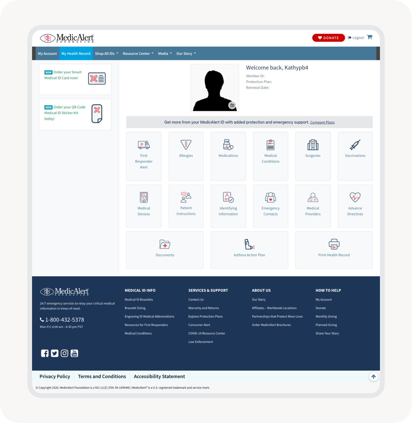
Building a Scalable Health Record Framework
Managing health information requires more than organizing data—it requires consistent ways for members to create, edit, and maintain that information across the platform.
Rather than designing unique interactions for every health record category, I created a shared framework that standardized how sections behaved while supporting the unique needs of each domain.
The content changed. The behavior remained consistent.
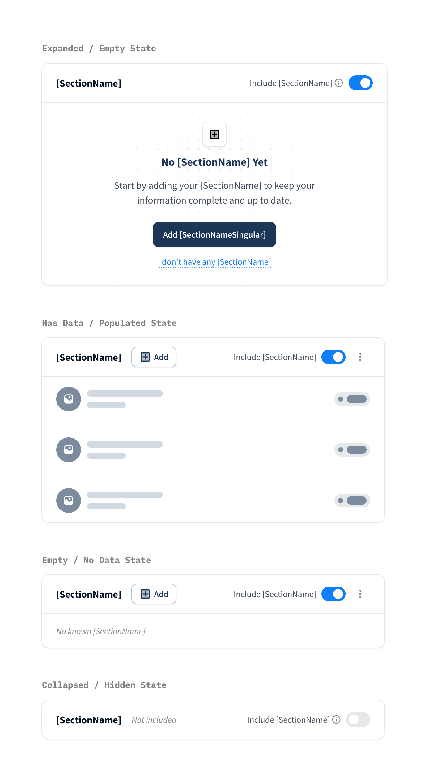
Framework Goals
Consistency: Create familiar interactions regardless of health record type.
Scalability: Support future health record categories without introducing new interaction models.
Reduced Cognitive Load: Allow members to focus on their information rather than learning new patterns.
Section Types
Standard Sections: Used for categories managed directly by members, such as conditions, medications, allergies, and medical devices.
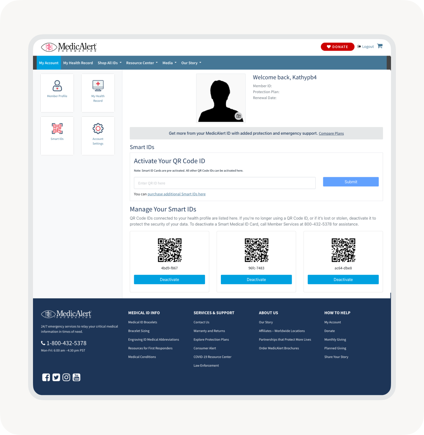
Record-Linked Sections: Used for categories that maintain relationships between records, such as physicians, insurance providers, and emergency contacts.
Shared States
Every section followed a consistent lifecycle: Empty, Populated, Expanded, Editing, and Linked Records.
Members encountered familiar actions throughout the platform: Add, Edit, Save, Cancel, Expand, and Collapse.
By standardizing these states across the platform, members encountered the same patterns whether managing medications, physicians, insurance, or emergency contacts. This consistency reduced cognitive load and created a seamless experience across desktop and mobile.
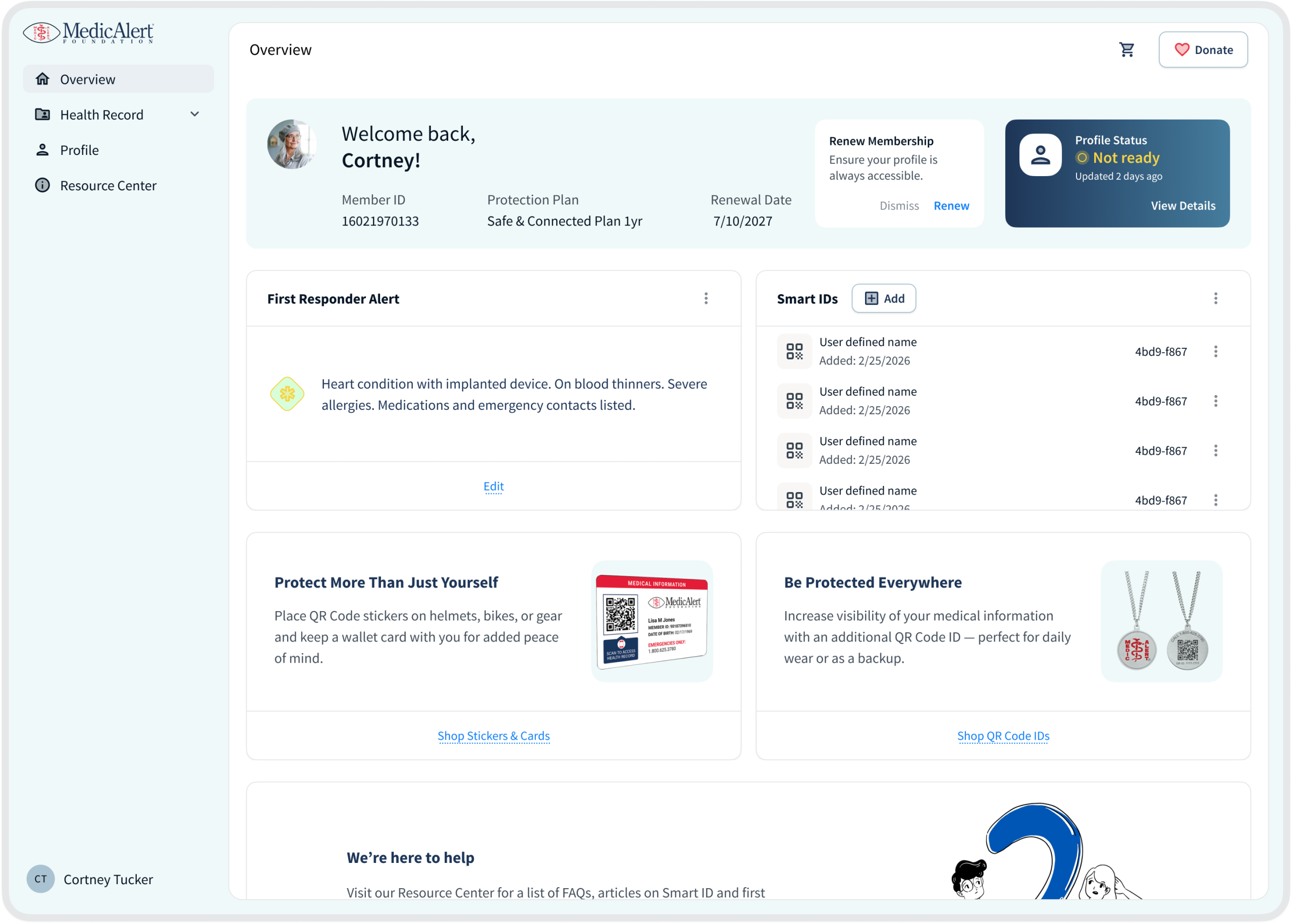
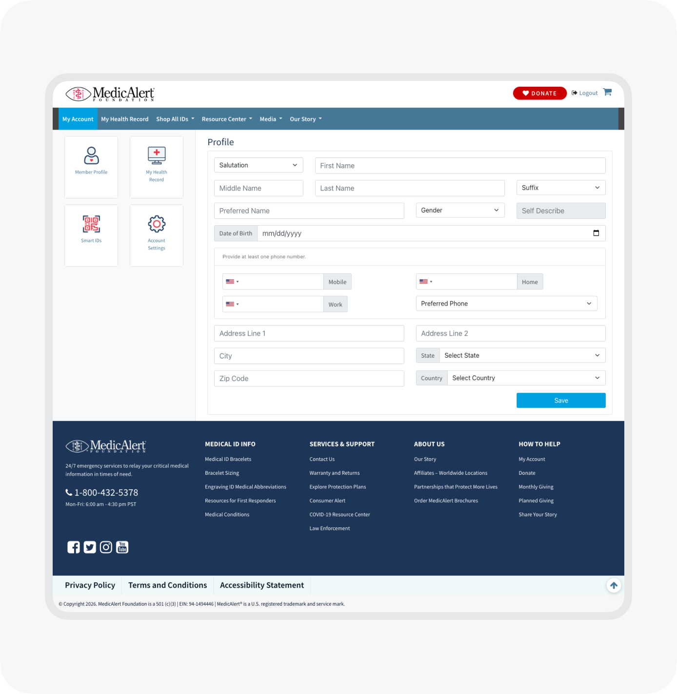
Reimagining the Member Dashboard
With a stronger foundation in place, attention shifted toward redesigning the dashboard experience itself.
The dashboard serves as the primary hub for managing health information, making clarity and usability critical. The redesign focused on improving information hierarchy, reducing visual complexity, and creating consistent patterns for managing records.
Key Improvements
Simplified Navigation
Improved access to important tasks and health record categories.
Consistent Interaction Patterns
Standardized how members add, edit, and manage information.
Responsive Experience
Created a seamless experience across desktop and mobile devices.
The result was a more approachable and scalable experience centered around maintaining life-critical health information.
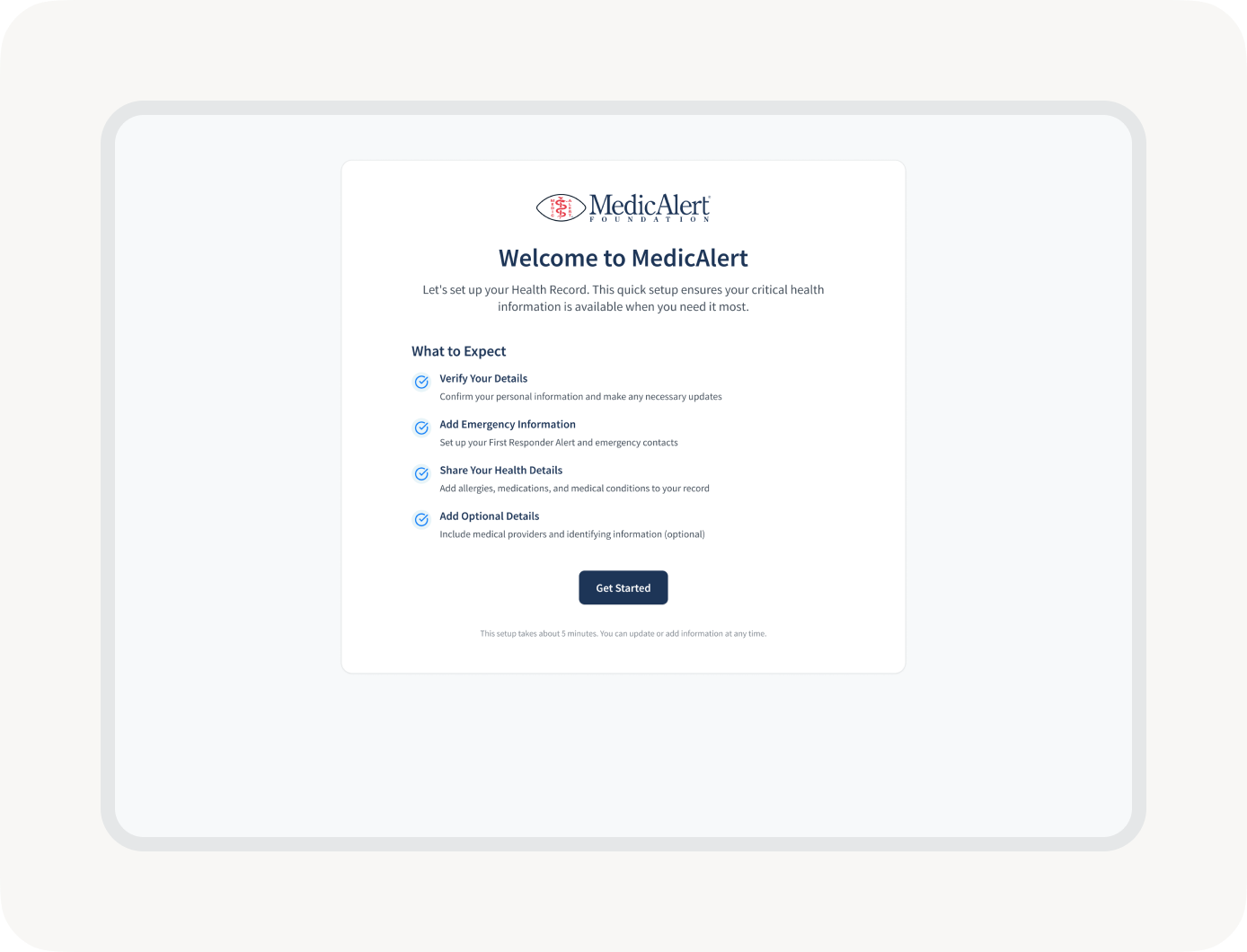
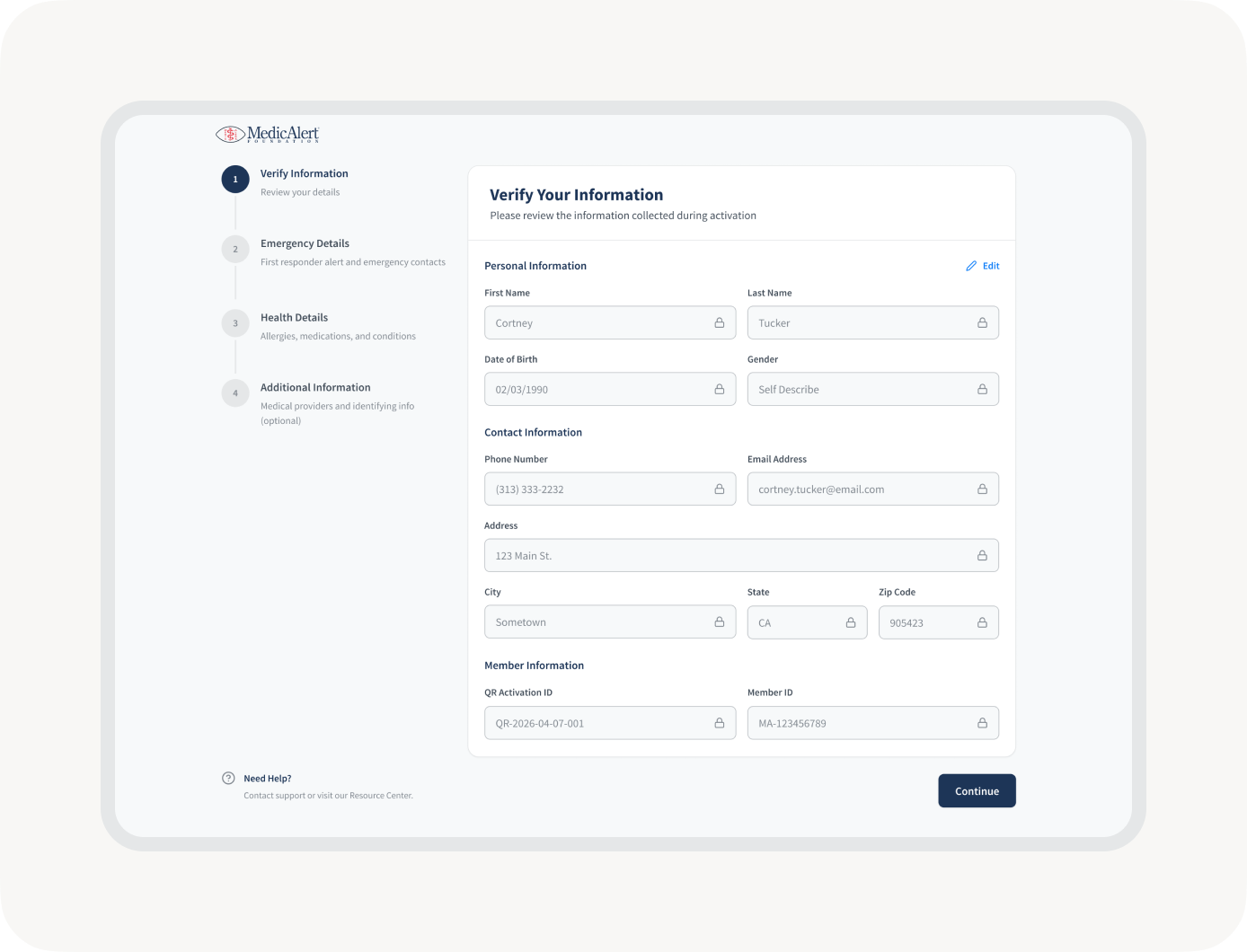
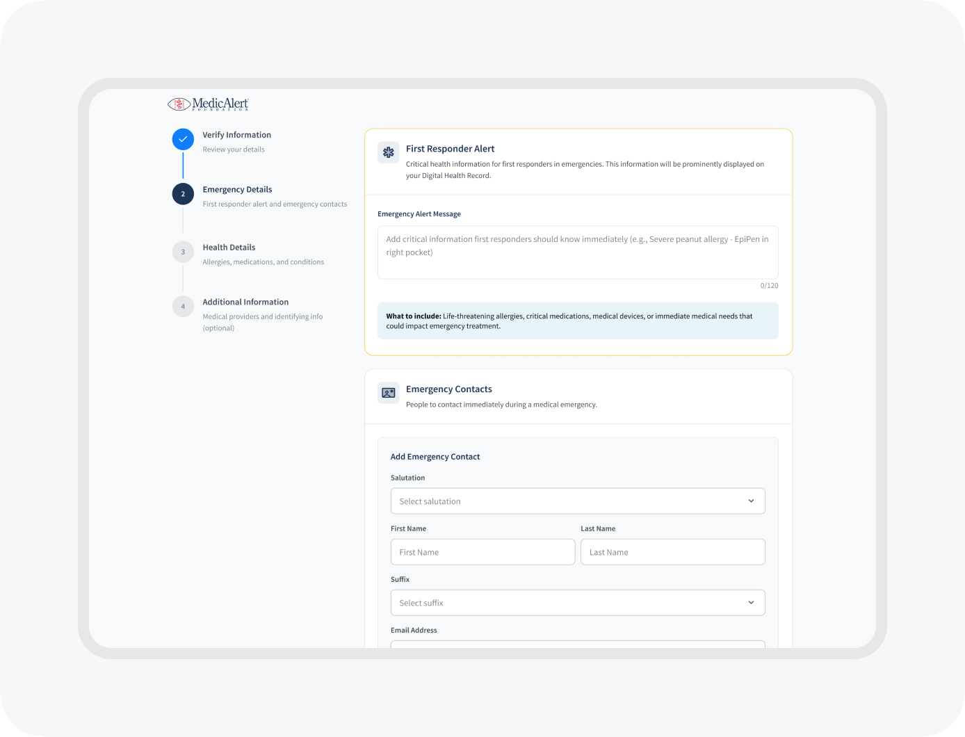
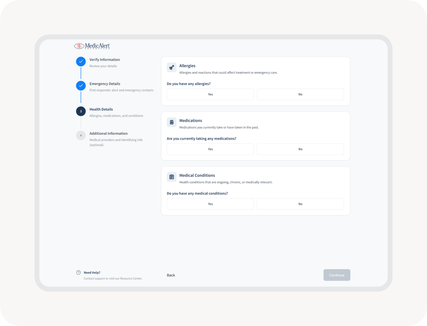
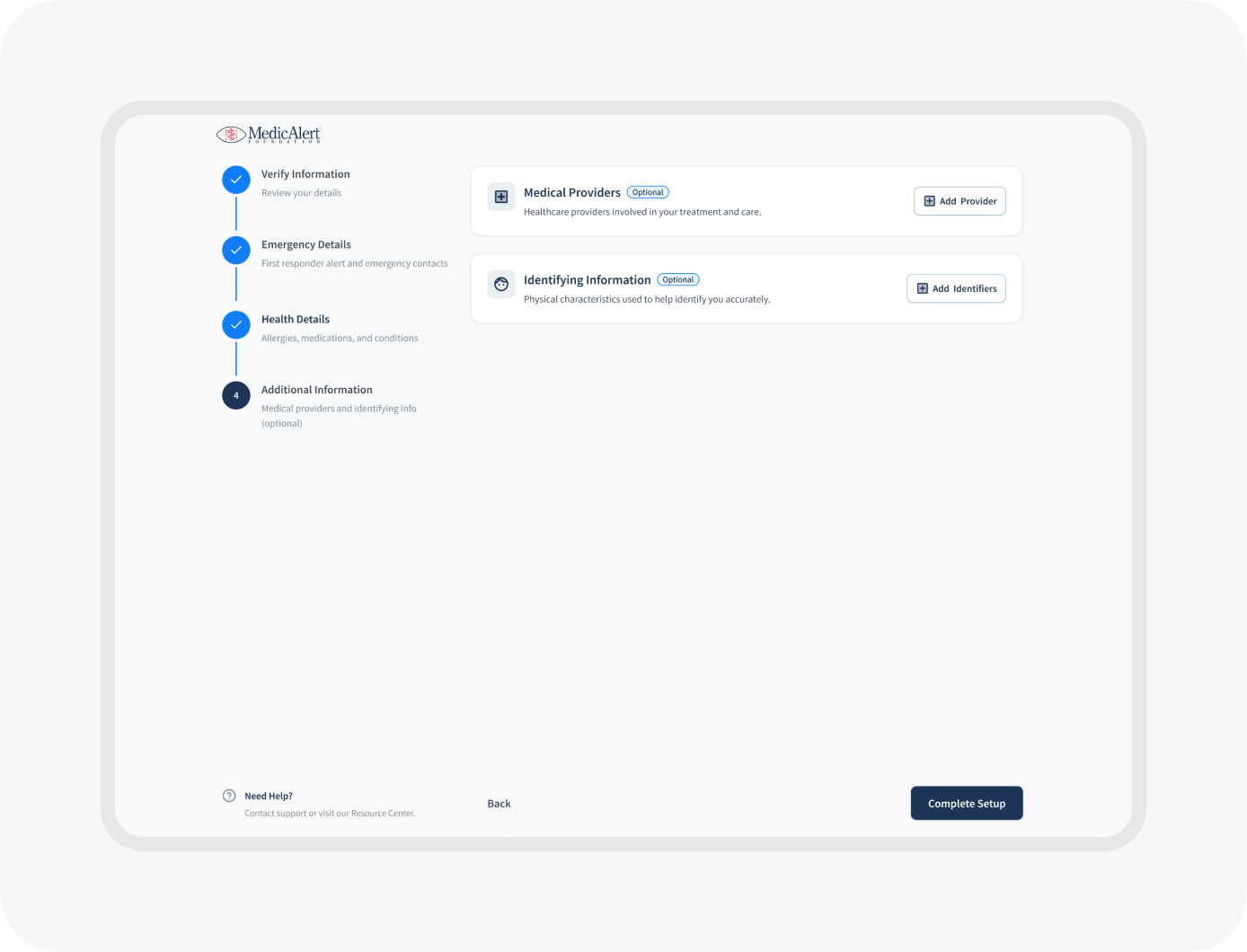
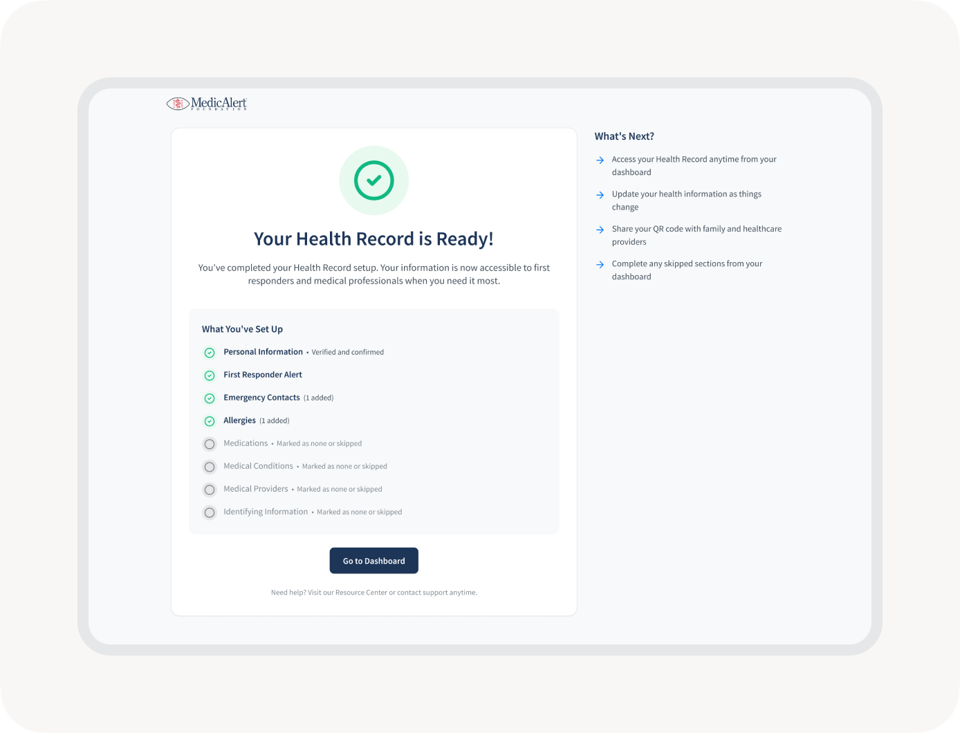
Improving Member Onboarding
Completing a health profile is one of the most important actions a member can take, but it can also be one of the most overwhelming.
I explored multiple onboarding approaches focused on reducing friction while encouraging members to complete the information most valuable during emergency situations.
The onboarding experience guided users through account setup, Smart ID activation, profile completion, and emergency contact creation while breaking complex tasks into manageable steps.
Design Principles
Progressive Completion
Reduce cognitive load by introducing information gradually.
Clear Guidance
Help members understand what information is required and why it matters.
Encourage Completion
Support members through setup without overwhelming them.
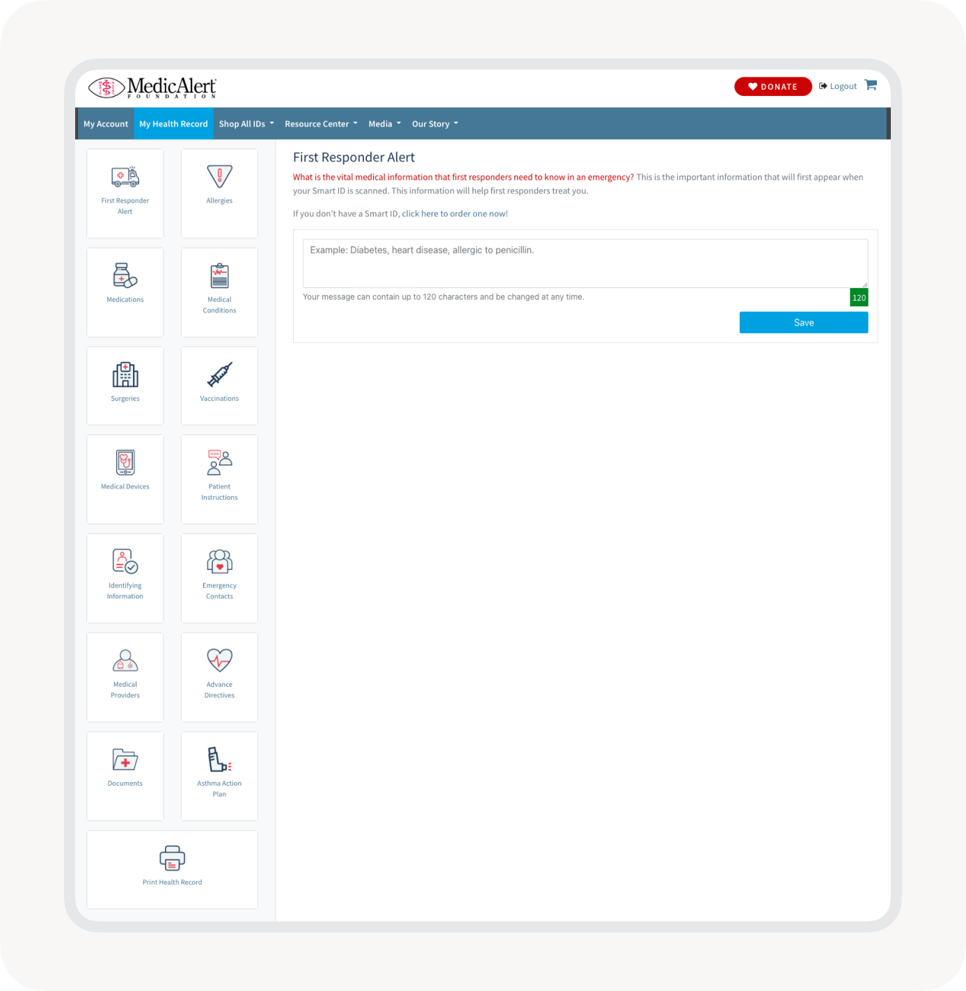
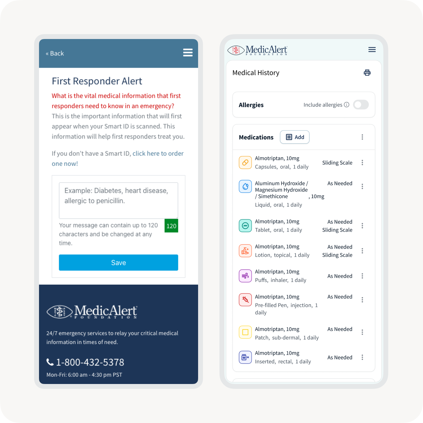
Designing for Emergency Access
MedicAlert serves more than the member. Emergency responders, healthcare providers, and caregivers may need immediate access to critical health information when every second matters.
To support these scenarios, I helped design a read-only health record experience optimized for rapid information retrieval and mobile accessibility.
Design Priorities
Speed
Surface critical information immediately.
Clarity
Reduce complexity during high-stress situations.
Mobile First
Ensure information is easily accessible from any device.
Trust
Present information in a way that supports confidence and decision-making.
This experience required a fundamentally different approach than the member dashboard, prioritizing information consumption rather than management.


Impact
The work established a stronger foundation for MedicAlert’s digital ecosystem while creating scalable patterns that can support future growth.
Outcomes
Unified Experience
Created greater consistency across onboarding, dashboard, and emergency-access experiences.
Scalable Frameworks
Established reusable patterns capable of supporting future health record categories and features.
Reduced Complexity
Simplified how members create, manage, and maintain health information.
Cross-Platform Consistency
Created shared interaction models across desktop and mobile experiences.
Foundation for Growth
Delivered systems and patterns designed to evolve alongside future product needs.
Key Takeaways
Systems Over Screens
The most valuable work was not a single interface, but the creation of reusable frameworks that support an entire ecosystem of health information.
Structure Creates Clarity
Organizing complex health information required thoughtful information architecture as much as visual design.
Consistency Builds Confidence
Predictable interactions reduced cognitive load and created a more approachable experience for members managing critical information.